If this is indeed the new Blue Jays logo, then I totally, totally love the new Blue Jays logo
 |
| Please. |
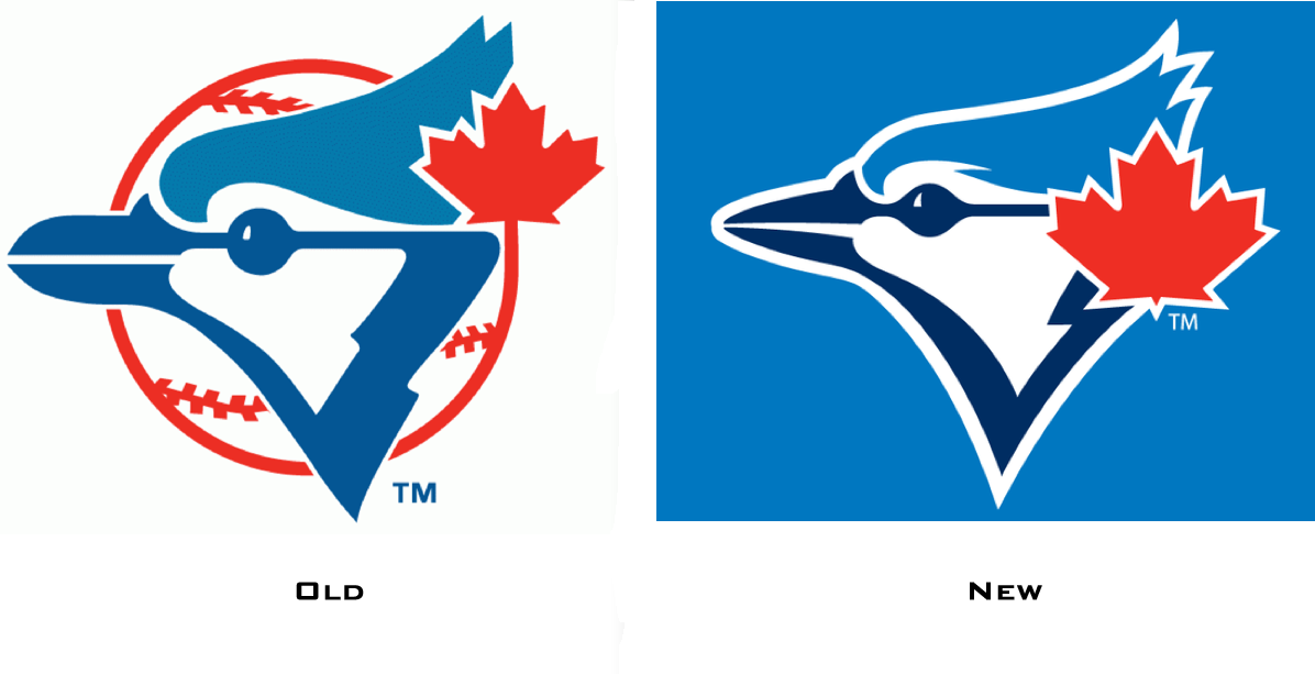
The Blue Jays were tremendously wrong to ditch their original logo in 1996; they were at least as wrong to replace that pretty bad second logo with the unspeakable T-bird in 2003. Mercifully, that lasted only a year. Since then, the current logo has been completely tolerable, in my view, but I think it is telling that I personally possess nothing aside from baseball cards that bear its mark: I am a man of the old logo. Perhaps because of this, I am also a man utterly thrilled -- yeah thrilled -- about the leaked logo. There are, as you can see, more than a few similarities. And I am totally, totally into that.
Maybe I'll get a new hat!
KS

No comments:
Post a Comment